Posts

Conversion anxiety: Why your website visitors resist the click

“I don’t want to adult today”

Remember as a child, the world seemed so easy to navigate? And then you grew up, and realized that you’re the responsible adult now, and the world is full of decisions and potential mistakes. Websites are a good representation of this, and a phenomenon known as conversion anxiety is very real. Today I’m going to talk about what this is, why it happens, how to overcome it, and perhaps sprinkle in a few other words of Helen wisdom along the way.

Click Me, A Mysterious World Awaits

Our spam folders have ruined everything. Once, a peaceful world of trust and love, we are now living in a time where scammers and phishermen rule supreme. No button is safe from the potential scare of malware and viruses, and our browsing habits and on-page actions reflect this. How many times have you been on a website with a button where you’ve thought “There’s no way I’m going to click that!”? And how many times has that website been, on the surface, a fairly reasonable looking page, with nothing outwardly suspicious? This anxiety is present in all of us, and it is probably happening right now on your businesses’ website. Go check, I’ll wait.

badCTAbutton

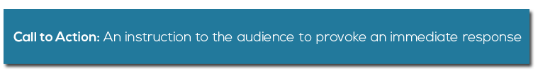
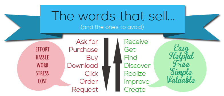
See? Somewhere on your homepage is a call-to-action that just screams “I’m leading you into the dark world of uncertainty”. It’s a button that says something like “Submit”, or “Click here”, or “Enter”. It’s a form that gives little information about the room behind the door. It might be a menu item, a page link, or a simple phone number. See where I’m going with this? Your call to action is creepy, and there ain’t no way in hell I’m going to do what you tell me, without a little more reassurance that it’s all going to be ok.

Why We’re Scared of Clicking Your Button

We’re not wimps. We’re businessmen, high-flyers, schmoozers, and risk-takers (I’m looking at you, entrepreneurs). So why are we so afraid of a little click-action? The fact is, your website’s call to action doesn’t tell us what to expect, and it’s not fear we’re experiencing, it’s common sense. If we clicked every Tom, Dick, and Harry button out there, we’d be in a bad way, with laptops full of viruses, inboxes full of spam, and bank accounts on the verge of collapse. We don’t click your button because your button doesn’t show any good intentions.

Borrowing Reputation through Trust Symbols

When the BBC publishes a news story, no one questions it. Why? Because the BBC is pretty darn reputable (and British, which is always a good thing to be in my book). And if you see a quote from the BBC somewhere else, you don’t question that either? Why? Because their reputation follows them. This is the whole idea behind trust symbols, it’s an image that makes your inner voice squeal “I know them!” and adds that reputation to the surrounding information. Right now, Netflix features the word “Emmy” in its headline, and it’s doing just that – adding the reputation of an industry-recognized award to the whole brand. And they’ve not even won anything yet!

Preventing Click Anxiety

To prevent anxiety on your webpage, all you need to do is a little hand-holding. Sprinkle a few of your best and most reputable trust symbols around the button, and let the website visitor know it’s all going to be ok. I also recommend adding in a few sentences about what this action will do – it turns the mysterious metal door into a lovely glass panel through which everything becomes clear again. If the button is a sign-up, let them know:

“Receive 3 emails packed with hints and tips, every month!”

Reassure them of any get-out clauses you might have:

“Unsubscribe anytime with our one-click process.”

Give them peace of mind that they’re not going to be left alone after taking the action:

“Our support team is available by phone 24/7 on (555) 867-5309”.

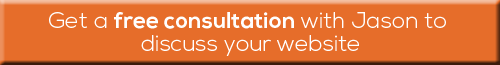
See it in action right here! Click below to find out exactly how we can help you improve your website even further. We’ll call you for a no-cost consultation and suggest ways to improve your website’s confidence. Join companies such as RPM, Jack in the Box, and Five Ten, who have worked with us to improve their conversions and online reputation. Or just call me, on (909) 748-5882 x 804.

Your Website Could Use a Refresher

Websites are like gardens – you need to keep watering them or they wilt. Something as simple as updating the call to actions can improve conversions by as much as 90%, and most sites that are a year or more old have elements that could be improved.

If you’re not frequently checking in with your website, it could be going stale. Here’s some typical changes our clients ask for that make a huge difference in the performance of their sites…

Update your software.

1Technology moves quickly, and just like ‘dog years’, a year in internet time is a big deal. If your software is out of date, you could be a prime target for spam attacks and costly site damage. Think you have nothing to steal? You’re still at risk. Hackers are not just looking to take – they’re wanting to use. You’re currently a prime target to those looking to use your site for spam, illegal file serving, and other nasty activities. hurting your reputation and taking months to repair the damage.

A quick software update could be all you need to have a faster, safer site, free from spam attacks and malware. Let us work our magic to keep your site safe and secure.

Freshen your SEO copy.

2Google updates its algorithms more often than I have a cup of tea – in the last few years we’ve seen the birth of Google Updates ‘Panda’, ‘Penguin’, and even a scary sounding ‘Payday Loan’, to name a few. These Google changes will have affected how your site shows up when people search. If your site has not been prepped for these changes, it’s a good bet that you’ve sunk down the rankings and slipped out of sight.

If your copy is earmarked as ‘spammy’ or ‘impersonal’, you could be losing your place in the Search Engine Results Pages. Let our Content Goddess Starr spring clean your content and boost your online reputation.

Make your site responsive.

6


You aren’t using the same technology that you were when your site originally launched. Internet Explorer has released 5 new versions in the last 5 years, and since 2009, mobile web browsing has grown from 1% to a third of all internet traffic. Is your site responsive and compatible with current browsers? If not, say goodbye to a large chunk of your potential leads. With a growing portion of web traffic now coming from mobile devices, it’s important to be ready.

If your site is not yet responsive, speak to us – we can do this for you.

Simplify your menu structure.

7bLong, confusing menus are so 2012. Web users are quick, and far too fickle to sift through complex menus to find what they want. We recommend 5 items or less on your main menu.

If your menu leaves visitors in a muddle, lets work together and streamline things.

Is it time for a total redesign?

3Does your website work as hard as your best employee? Could you pay someone to work 24 hours a day, 7 days a week to adequately and consistently sell your product? Would you rather just have more leads, more income, and less to worry about? A redesign helps you to spend less and earn more.

We work with different budgets to achieve exactly what you’re looking for. Get in touch to find out how we can help you make more sales.

Refresh and update for less.

Websites should grow with your business. Our monthly support plans allow them to do just that, at a price that works for you.

On our Silver plan ($89 a month), you not only get government-grade security and fabulous 24/7 support, but you also get an included design hour every month (this alone is worth $129). You can use this to make gradual updates as and when they’re needed.

For more included design hours, or multiple sites, try our Gold or Platinum plans. Our customers love them!

ctaorange

The Call to Action: Why one little tweak might be all you need

CTA description

A single change, 90% more clicks.

Getting the call-to-action right is a fine art. Unbounce.com recently ran a test on one of their landing pages that offered a free 30-day trial to new users. All they did was change “You” to “My”, making the new call-to-action read “Start my free 30 day trial”. Within three weeks, they had raised their click-through rate by 90%. In another example of excellent CTA optimization, MatchOffice.com reworded the text of one of their buttons from “Order Information” to “Get Information”, and saw nearly 15% more people click it.

Easily do it on your own website.

All it takes is one simple tweak to a button, and you have a recipe for success. People respond better when they a required to put in minimal effort. Single words carry many connotations, so you need to make sure you are picking the right ones that say the right things about you.

the words that sell

Get us to do it for you.

OpenPotion has been advising companies on conversion optimization techniques like this for years, and we can help you. Changes like this are quick and easy to do, and it will surprise you just how effective they are. Simply click the button below and we’ll be in contact shortly to get started.

CTAsalesbutton

Pssst, a little sneaky discount for our clients.

Cut some corners and get a pretty great deal. Should you subscribe to our Silver Plan, you will benefit from an included hour of website development every month (a value of $129!) to make tweaks and touches to your website. Amazing! Here’s just some of the things you could do with that time…

features

Click here to see more of our Plans and Pricing.